User superss2104 uploaded the image
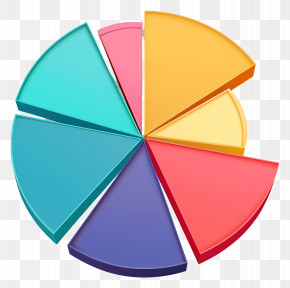
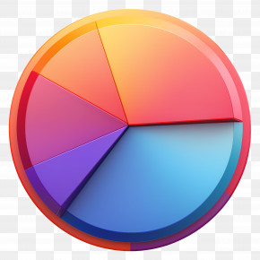
A pie chart that shows the percentage of people who have been diagnosed with cancer. The chart is circular in shape and has six sections, each with a different color - red, green, yellow, orange, pink, blue, and light blue. The colors are arranged in a way that they are overlapping each other, creating a sense of depth and dimension.
Pie Chart - 3D Multicolored Pie Chart Illustration PNG
. The resolution of this PNG file is 3692 x 2816 pixels and it has a file size of 4.54 MB.A pie chart that shows the percentage of people who have been diagnosed with cancer. The chart is circular in shape and has six sections, each with a different color - red, green, yellow, orange, pink, blue, and light blue. The colors are arranged in a way that they are overlapping each other, creating a sense of depth and dimension.
Pie Chart - 3D Multicolored Pie Chart Illustration PNG
Related PNG Images