User riamisu uploaded the image
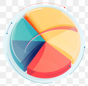
A pie chart that shows the percentage of people who have been diagnosed with cancer. The chart is divided into six sections, each with a different color - orange, pink, yellow, blue, and light blue. The orange section is on the left side of the chart, the pink section is in the middle, the yellow section is at the top, and the light blue section is to the right. The pie chart is set against a transparent background.
Pie Chart - 3D Colorful Pie Chart Illustration PNG
. The resolution of this PNG file is 3876 x 3068 pixels and it has a file size of 3.31 MB.A pie chart that shows the percentage of people who have been diagnosed with cancer. The chart is divided into six sections, each with a different color - orange, pink, yellow, blue, and light blue. The orange section is on the left side of the chart, the pink section is in the middle, the yellow section is at the top, and the light blue section is to the right. The pie chart is set against a transparent background.
Related PNG Images