User Jagoljp07 uploaded the image
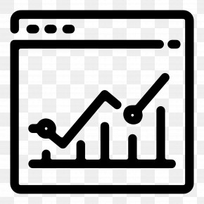
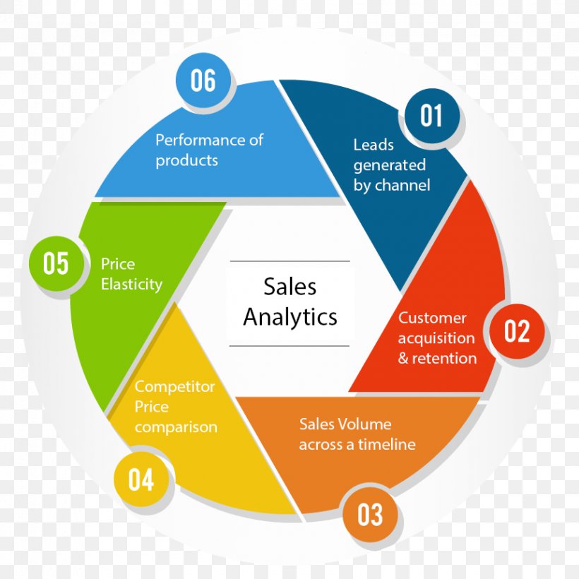
A circular diagram that represents the sales analytics process. It is divided into six sections, each representing a different stage of the process. The first section is labeled "Performance of products" and shows the number of products that lead to a channel. The second section is titled "Leads generated by channel" and has a label that reads "Customer acquisition & retention". The third section is labelled "Competitor Price Comparison". The fourth section has labeled "Sales Volume across a timeline". The fifth section has numbered "05" and "Price Elasticity". The sixth section has a description of the product, which states that the product is a competitor price comparison. Overall, the diagram is a visual representation of the various stages of sales analytics and how they interact with each other.
Sales Dashboard Analytics Product Performance Indicator PNG
. The resolution of this PNG file is 860 x 860 pixels and it has a file size of 242.40 KB.A circular diagram that represents the sales analytics process. It is divided into six sections, each representing a different stage of the process. The first section is labeled "Performance of products" and shows the number of products that lead to a channel. The second section is titled "Leads generated by channel" and has a label that reads "Customer acquisition & retention". The third section is labelled "Competitor Price Comparison". The fourth section has labeled "Sales Volume across a timeline". The fifth section has numbered "05" and "Price Elasticity". The sixth section has a description of the product, which states that the product is a competitor price comparison. Overall, the diagram is a visual representation of the various stages of sales analytics and how they interact with each other.
Sales Dashboard Analytics Product Performance Indicator PNG
Related PNG Images