User burrowiey45 uploaded the image
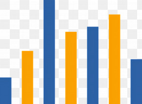
A bar graph that shows the number of people who have been diagnosed with cancer. The x-axis of the graph is blue, while the y-axis is orange. The bars are arranged in a horizontal line, with the blue bars on the left side, the orange bars in the middle, and the yellow bars at the bottom. The graph appears to be a visual representation of the data being presented.
Bar Graph - Simple Bar Graph Illustration For Data Representation PNG
. The resolution of this PNG file is 2048 x 1772 pixels and it has a file size of 555.04 KB.A bar graph that shows the number of people who have been diagnosed with cancer. The x-axis of the graph is blue, while the y-axis is orange. The bars are arranged in a horizontal line, with the blue bars on the left side, the orange bars in the middle, and the yellow bars at the bottom. The graph appears to be a visual representation of the data being presented.
Bar Graph - Simple Bar Graph Illustration For Data Representation PNG
Related PNG Images