User brulism uploaded the image
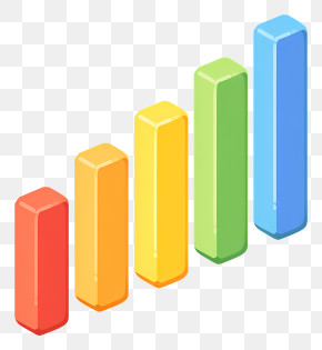
A bar graph that shows the number of people who have been diagnosed with cancer. The bars are arranged in a horizontal line, with the highest bar at the bottom and the lowest at the top. The highest bar is white, while the lowest bars are orange. The graph appears to be a visual representation of the percentage of people diagnosed with the cancer over time.
Bar Graph - Minimalistic Graph Bars In Soft Colors PNG
. The resolution of this PNG file is 2048 x 1788 pixels and it has a file size of 620.35 KB.A bar graph that shows the number of people who have been diagnosed with cancer. The bars are arranged in a horizontal line, with the highest bar at the bottom and the lowest at the top. The highest bar is white, while the lowest bars are orange. The graph appears to be a visual representation of the percentage of people diagnosed with the cancer over time.
Related PNG Images